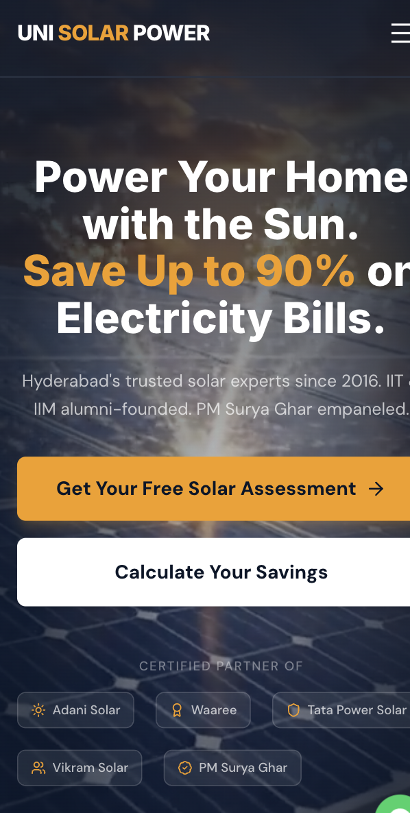
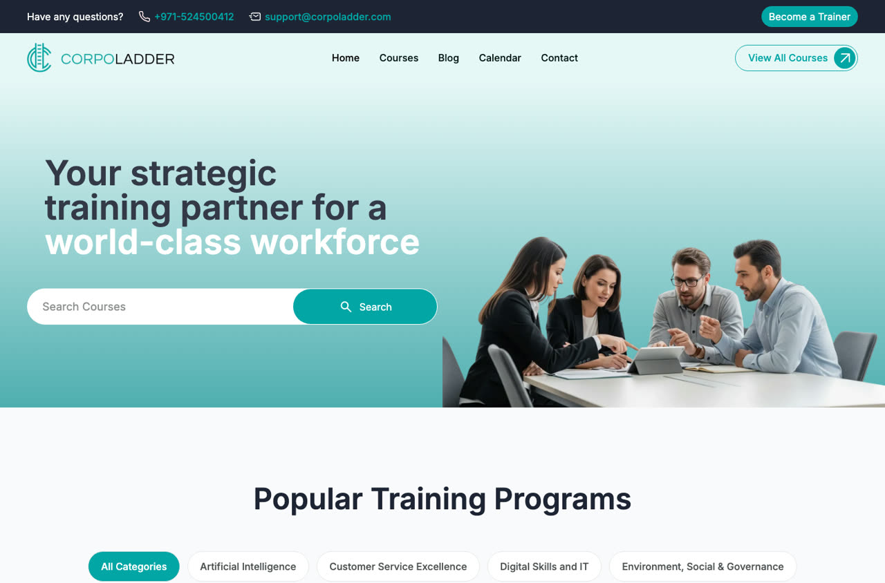
Unisolar Power
A Hyderabad-based solar EPC company closing high-value B2B contracts. Their website was doing the opposite of selling — it was creating doubt before a single conversation could happen.
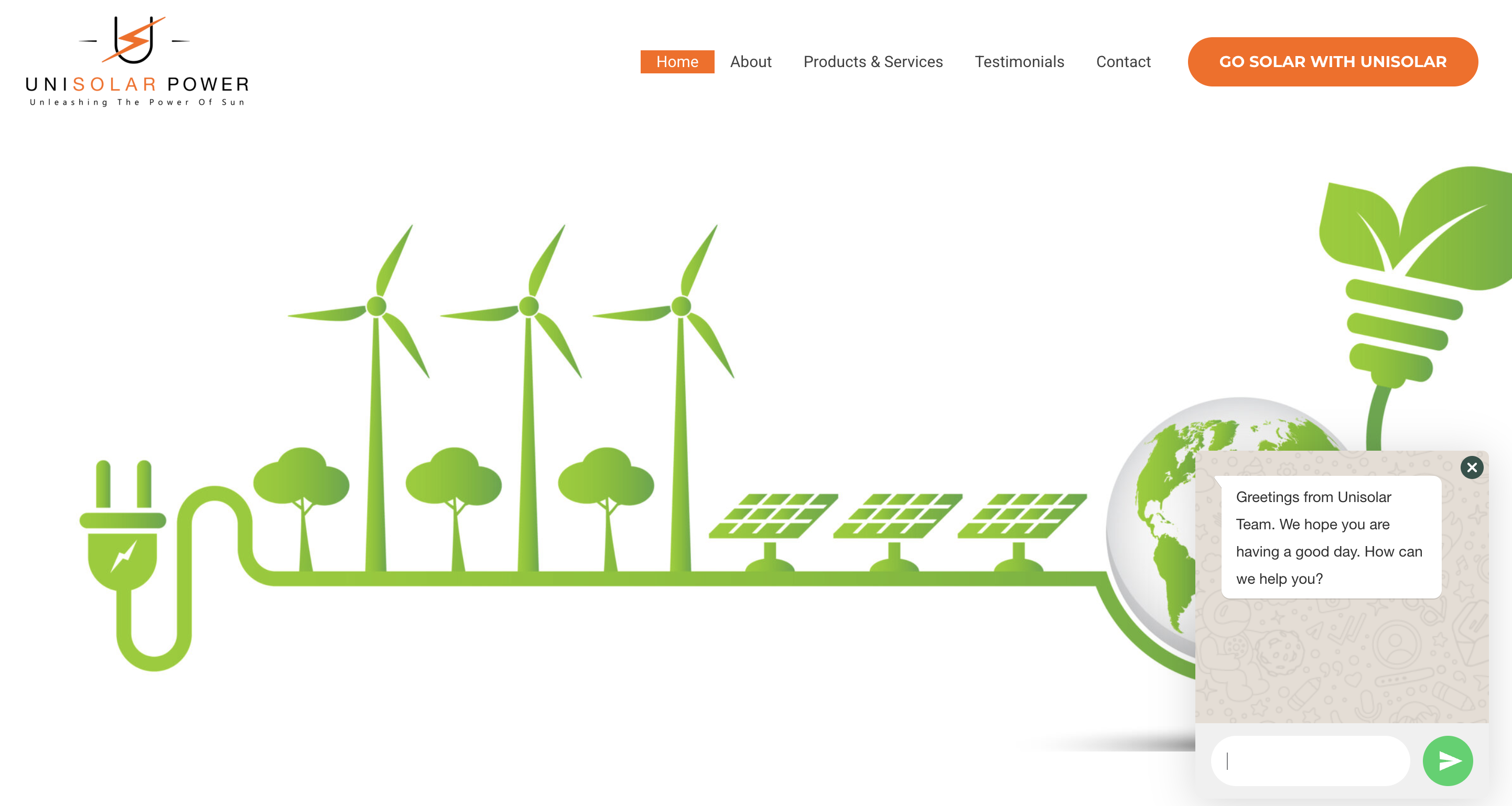
- Desktop site with a circa-2012 visual style — stock images, mismatched fonts, no clear hierarchy
- Browser security warnings on multiple pages — the kind that make enterprise buyers close the tab immediately
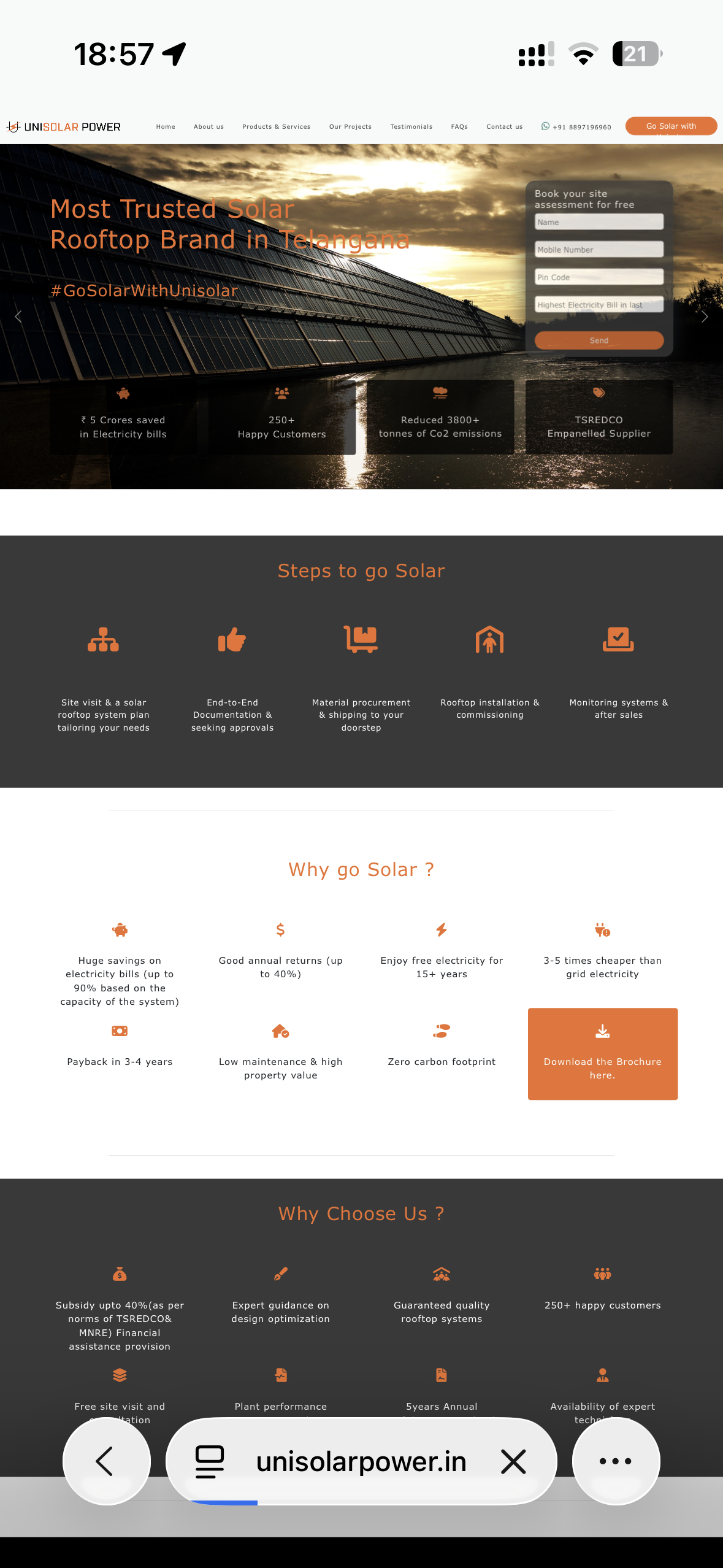
- Mobile view completely broken — text overflowed, images clipped, CTAs hidden below the fold
- No lead capture beyond a buried contact form
- Copy focused entirely on features and certifications, never on client outcomes
Solar EPC clients are making six- and seven-figure decisions. They do not call companies that look like they cannot afford a proper website. Every day the old site was live, it was actively filtering out prospects before any conversation started.
The security warnings were the worst part. In B2B, trust is everything. A browser flagging your site as insecure is a deal-killer — most visitors do not get past that screen.
The mobile problem compounded everything: over 65% of their traffic was coming from phones, and those visitors were hitting an unusable experience.
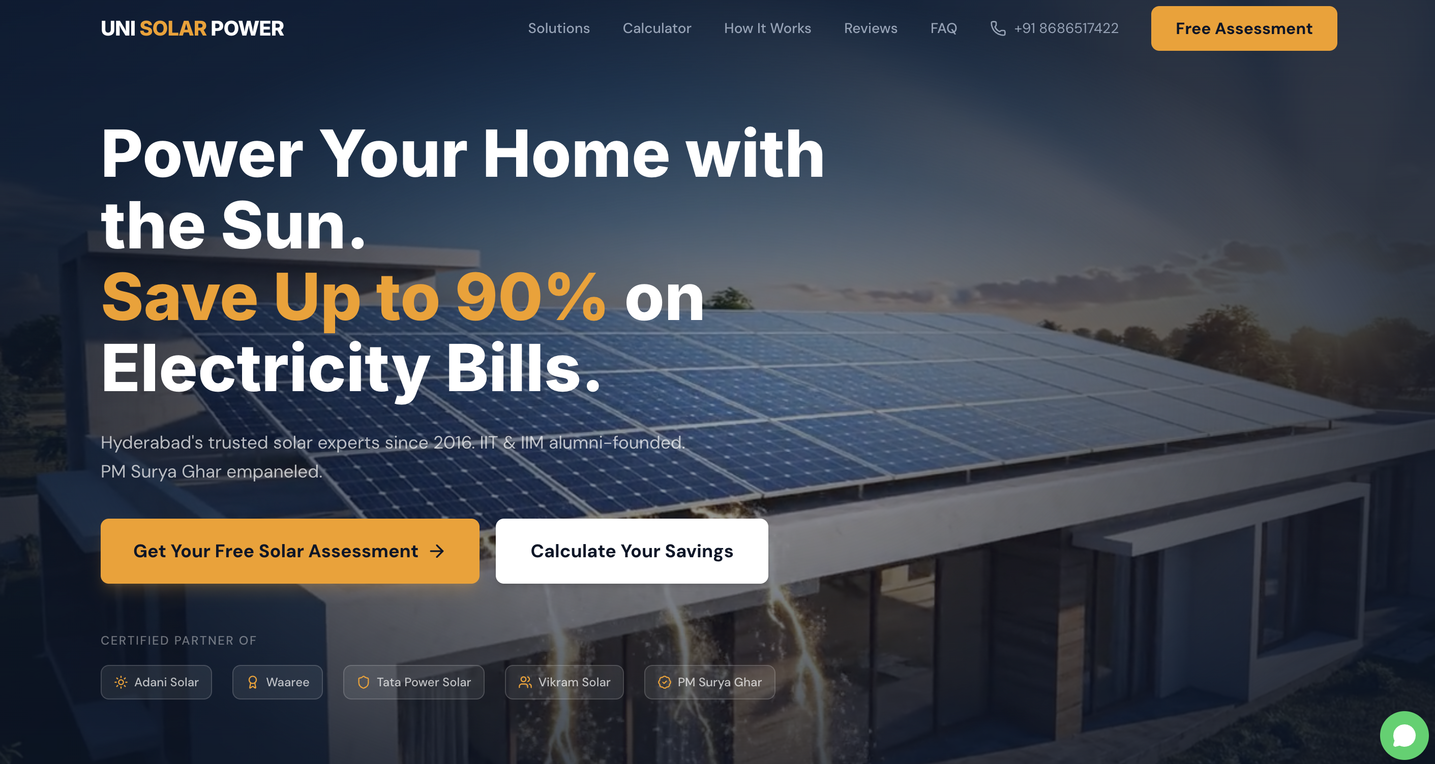
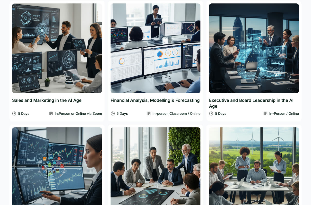
- Complete visual rebuild — new colour system, type hierarchy, and layout language that signals scale and credibility
- Security overhaul — HTTPS, clean certificate setup, all warnings resolved
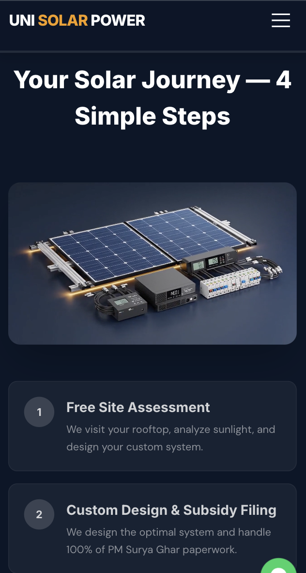
- Mobile-first redesign — every section rebulit to work on a 390px screen first, then scaled up
- Outcome-first copy — every page rewritten around what the client gains, not what Unisolar does
- Lead capture on every page — WhatsApp CTA, inquiry form, and a project estimator prompt
- Technical SEO foundation — structured data, meta tags, clean URLs, Core Web Vitals under 2.5s